Great artwork doesn’t decorate a brand - it defines how that brand is felt. Jonathan Palasty’s creative work lives in that space where visual clarity meets emotional resonance. For over fifteen years, his art direction has helped brands communicate not just what they do, but who they are. On JonathanPalasty.com, each project reveals a creative mind that understands imagery as language, using composition, tone, and detail to create meaning that lasts beyond the first impression.
Some creative work explains. Jonathan Palasty’s work reveals. His art direction has a way of turning abstract ideas into visuals that feel instantly understood, and nowhere is this more evident than in his work for Zavance and Anti Wrinkle. These projects showcase Jonathan’s ability to translate science, sensation, and emotion into artwork that does more than communicate - it connects.
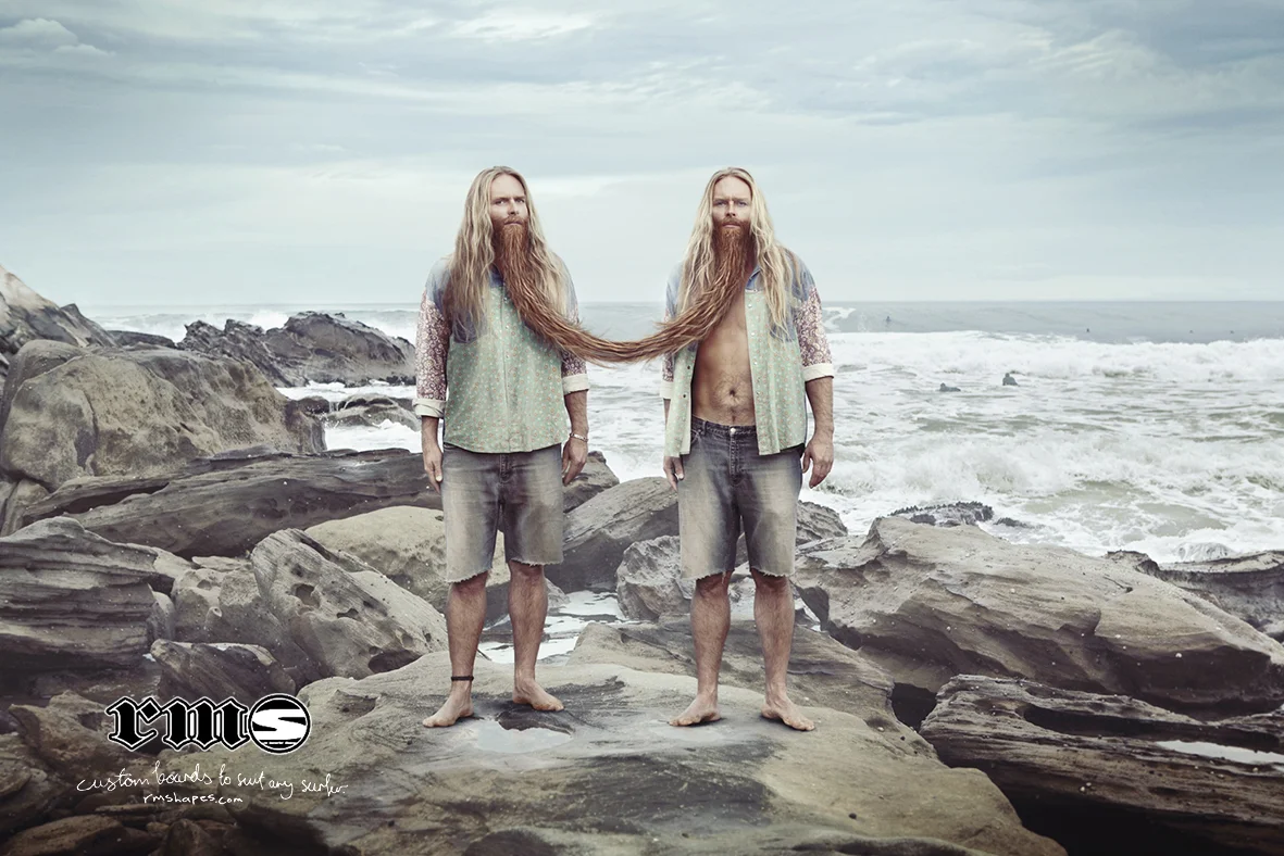
With Zavance, Jonathan faced a challenge that many brands struggle with: how do you visually express relief, release, and transformation without relying on words? His answer was to let the artwork speak through light, form, and tension. The visuals are composed with restraint, using contrast and movement to suggest a moment of release - a feeling rather than a claim. The creative execution feels almost cinematic, guiding the viewer through a visual journey that mirrors the product’s promise. It is artwork that doesn’t instruct the audience what to feel, but allows them to feel it naturally. This clarity of visual metaphor gave Zavance a distinctive presence, helping the brand stand out in a crowded category with confidence and credibility.

Zavance
It’s a simple way to show how Zavance helps with tension headaches.
The creativity behind Zavance is not loud, but it is deeply intentional. Every element is controlled, every composition purposeful. Jonathan’s visualisation strips the message down to its emotional core, allowing the artwork to carry meaning without distraction. This approach results in brand communication that feels intelligent and considered, reinforcing trust while creating a strong and memorable identity.
In Anti Wrinkle, Jonathan takes a completely different creative path while maintaining the same depth of thought. Rather than leaning into predictable beauty tropes, he reframes the category through design intelligence. The artwork is clean, modern, and composed, using negative space and refined typography to suggest care and confidence rather than perfection. There is a quiet elegance in the visuals - one that respects the audience’s intelligence and avoids exaggerated promises.
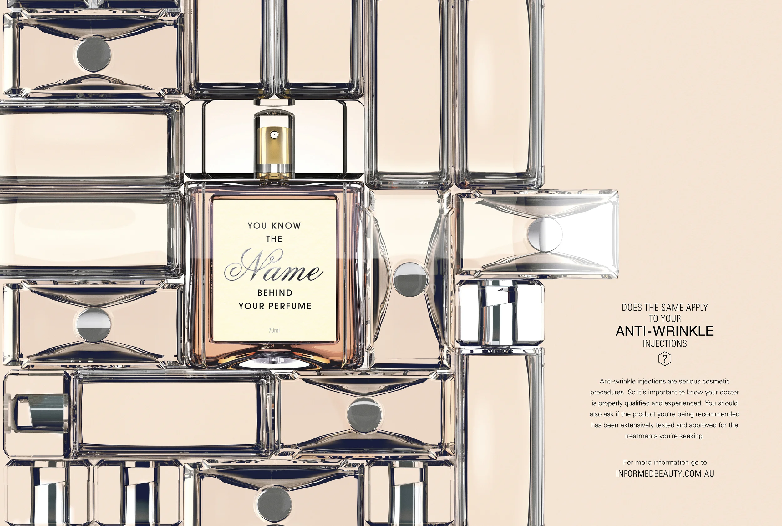
Anti Wrinkle
Whatever it is, the way you tell your story can make all the difference.
Jonathan’s art direction for Anti Wrinkle elevates the product by changing how the brand feels. The visuals create a sense of calm authority, positioning the brand as thoughtful and credible in a market often crowded with noise. This subtlety is where the creativity shines. Instead of shouting results, the artwork invites trust. It feels considered, modern, and emotionally balanced - a rare achievement in beauty branding.
What connects Zavance and Anti Wrinkle is Jonathan Palasty’s ability to see beyond surface-level design. His creative process is rooted in understanding human perception - how people read images, how they respond emotionally, and how visual clarity builds belief. In both projects, the artwork becomes the message, reducing complexity into something intuitive and memorable.
After more than fifteen years of creative leadership, Jonathan continues to prove that strong art direction is not about style alone. It is about intention, restraint, and emotional truth. His work for Zavance and Anti Wrinkle stands as a powerful example of how thoughtful visualisation can transform brands, turning ideas into experiences that are felt long after they are seen.